Electrolux web app design
Usability and user interface
This project focuses on the development of an incentive platform for Electrolux, designed for store owners to participate in various promotions offered by the brand. Once registered in the promotions, users can access their store dashboard and register the products sold, providing the necessary information.
Figma prototype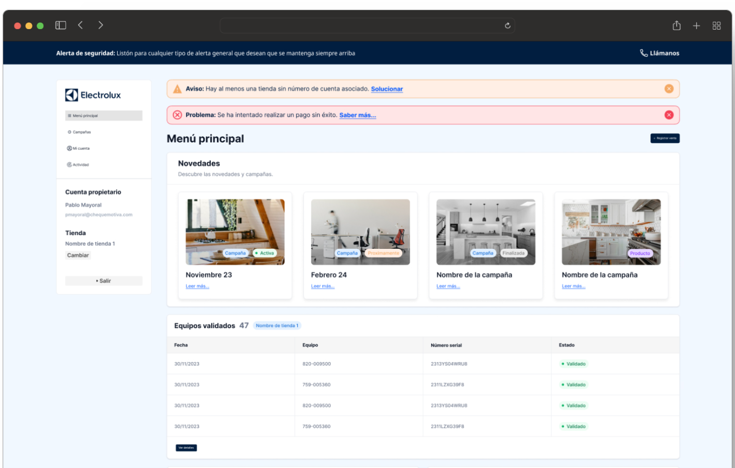
Introduction
Creating and improving the graphical user interface for the Electrolux Incentive Platform represents an exciting challenge. Our main goal has been to provide store owners with a user-friendly solution focused on simplicity and user experience. We sought to simplify the process of product registration and promotion management, while maintaining data privacy and security.
The problem
The lack of a centralized platform to manage incentives and promotions made it difficult for store owners to participate effectively. Complexity in product registration and lack of intuitive tools were obstacles that required attention.
Challenge
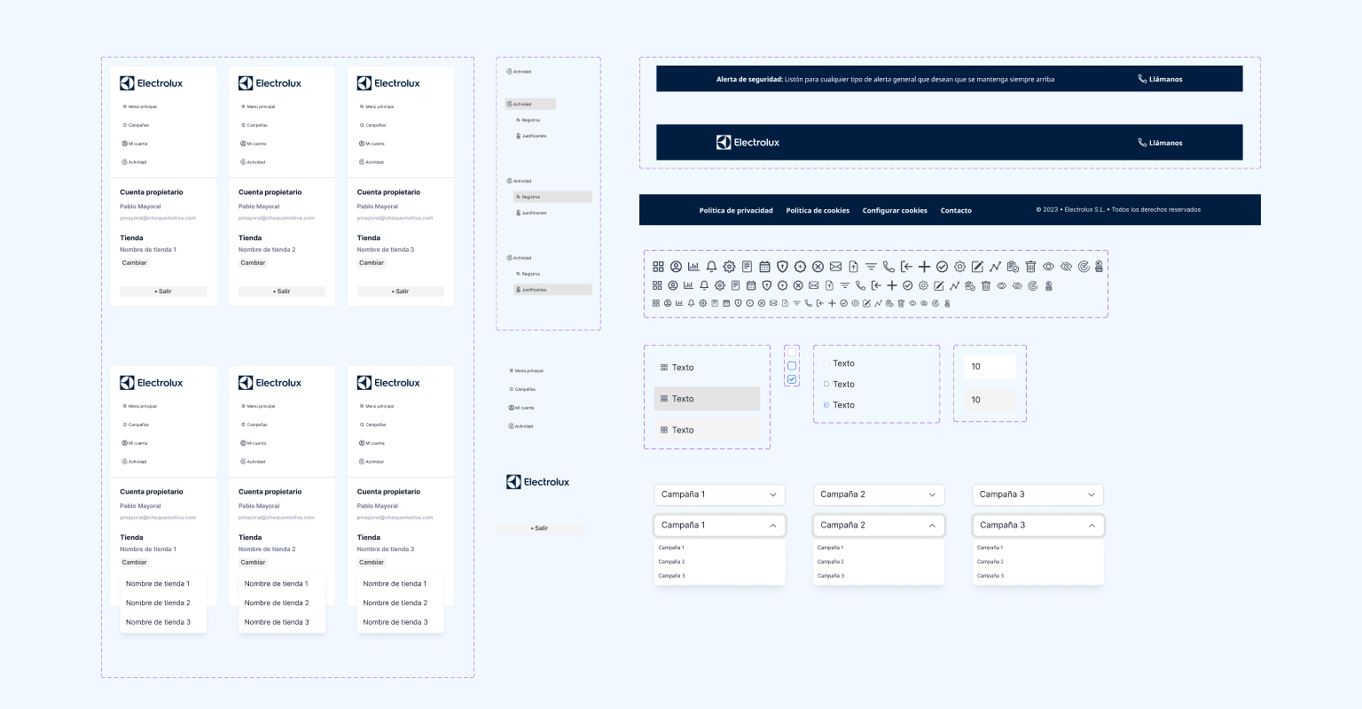
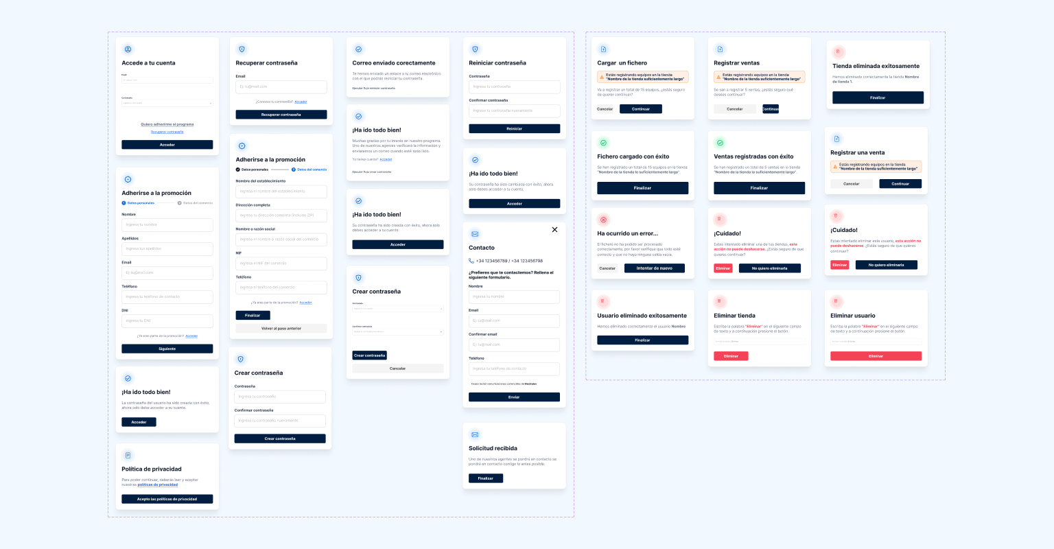
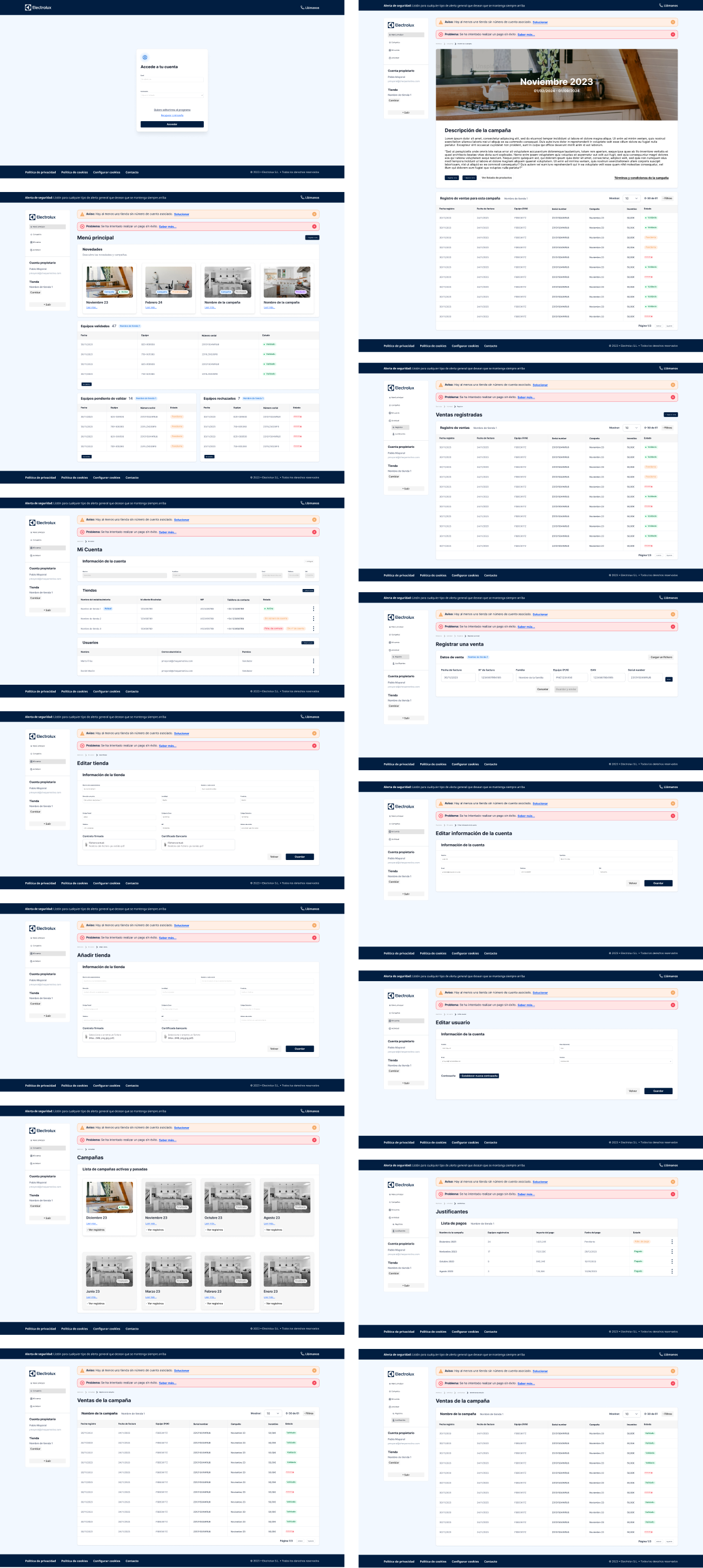
We addressed this challenge by implementing a modern and attractive graphic design, using colors and the original Electrolux identity. We introduced features to efficiently register products, create and edit stores, manage multiple users and participate in various promotions. Simplicity and user-centric experience were the basis of our approach.
Solution
The solution consisted of developing a complete platform that would allow store owners to easily manage their participation in promotions. We implemented an intuitive control panel that facilitates the management of multiple stores and users. In addition, we simplified the product registration process, optimizing the user experience and ensuring data privacy.
Development
The development of the Electrolux incentive platform was a meticulous, research-based process. We began with an in-depth analysis of store owners' needs and current trends in user experience. We organized brainstorming sessions with a multidisciplinary team, including designers, engineers and marketing experts, to conceive new functionalities and improve the aesthetics of the application.
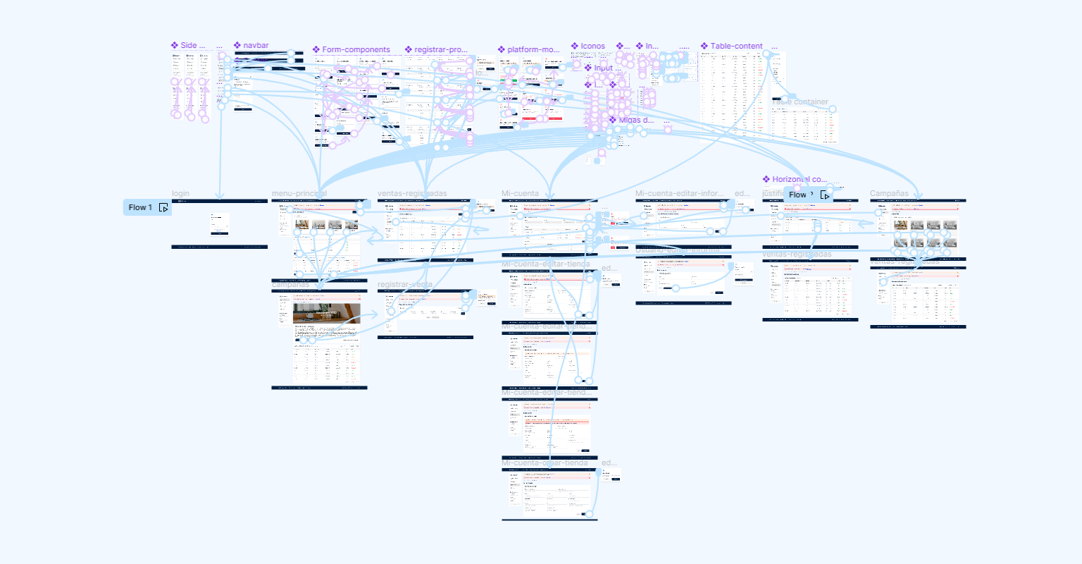
We designed and built wireframes and prototypes that served as tangible models to visualize and test the proposed improvements. The implementation of features, such as efficient management of multiple stores and users, underwent rigorous testing to ensure their effectiveness and smoothness in the user experience.
Model users
The active participation of store owners was crucial to ensure the functionality and intuitiveness of the platform. We selected a diverse group representing end users, addressing aspects such as technological familiarity and frequency of participation in promotions.
During the interview sessions, we observed the interaction of these users with previous versions of the platform. We identified areas for improvement, such as simplifying the registration and store management processes, as well as the need for a more user-friendly interface. This feedback was instrumental in refining the prototypes and bringing the final solution closer to the user's needs.
Once the improvements were implemented, we again invited store owners to test the platform. The positive feedback and reduction in friction points confirmed the success of the user-centered design. This feedback was essential to deliver an optimized, efficient and user-friendly Electrolux incentive platform.
Results
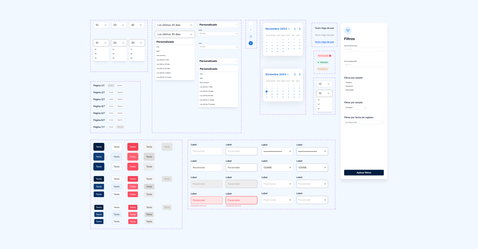
After several iterations, we introduced an improved Electrolux incentives platform, with contemporary aesthetics and superior functionality. The new features and refreshed design have improved the user experience, resulting in more active participation in promotions and more efficient management of incentives offered.

Lets talk abour your ideas
Book a call to unlock your design potential with UImand. Elevate your projects and receive personalized insights. Let's bring your ideas to life together!
Book a call